
New Scan Flow & UI
-
The heart of the Rocketbook App is scanning notebook pages. However, Rocketbook users were confused by the UI while Scanning. They complained that it took too long to scan pages and didn't understand certain messaging.
-
I conducted virtual and in-person interviews with Rocketbook users to identify the specific issues they were experiencing while scanning. I designed a variety of solutions and worked with my team to decide what screens and UI would be used in the Rocketbook App.
-
After launching the new Scan flow and UI, the page scan time was reduced significantly - about 1 to 2 seconds. Both long-term and new users were scanning more frequently monthly.
What’s Wrong with Scanning?
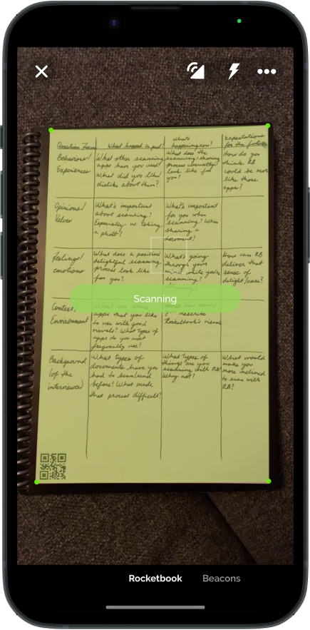
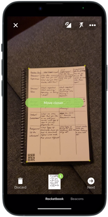
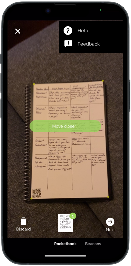
Rocketbook users felt it took too long to scan their Rocketbook pages. They identified certain UI elements as unnecessary and confusing, such as the “Loading” messages that would “sputter” while a scan was captured. In addition, the current Scanning screen looked inconsistent with the rest of the Rocketbook app.


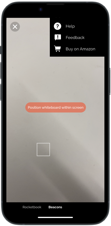
New UI, New Rocketbook
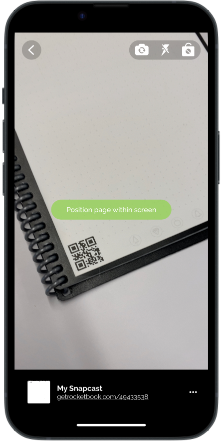
Updated iconography, narrower margins, new menus, and a larger camera space made the Scanning screen feel larger and easier to use. With these updates, the Scanning screen felt more in-line with the rest of the Rocketbook App.

A Whole New Flow
Scanning time was significantly reduced after replacing “Loading” and “Processing” messaging with a buffering icon animation. When users opened the Rocketbook App, they would see the Scanning screen before the Home page, allowing them to scan faster than before.